How many lives can you save?
Vaccination order really matters (please don't jump the line)
Step 1: Pick a population
Step 2: How would you roll out vaccines to adults 18 and older?
How to prioritize scarce vaccinations?
There is a saying in data circles: if you don’t use good data for decisions, you can only be wrong or lucky.
When deciding how to allocate COVID vaccines, anything other than using the best data is inexcusable, since “wrong” means that people die. There is no getting lucky.
We recently learned that in some states, as many as half of all vaccines were being diverted to people under 65. We’ve also heard that some states are planning to open up vaccination to all ages under 65 as one big group.
If the goal of rationing scarce vaccine doses is to save the most lives, these are bad things. Here’s why.
Age is the dominant risk factor for death from COVID infections – with increased death risks of 10x, 100x or 1000x or more. The age effect is so large that other real factors like health “comorbidities” (< 9x) and occupational risks (< 3x) become almost insignificant when it comes to saving lives. (You can explore individual risks by age and comorbidity in detail with this great interactive chart from The Economist).
The CDC data below shows that starting with the 18 to 29 age group, the death risks increase about 3x every time you move up to the next age group.
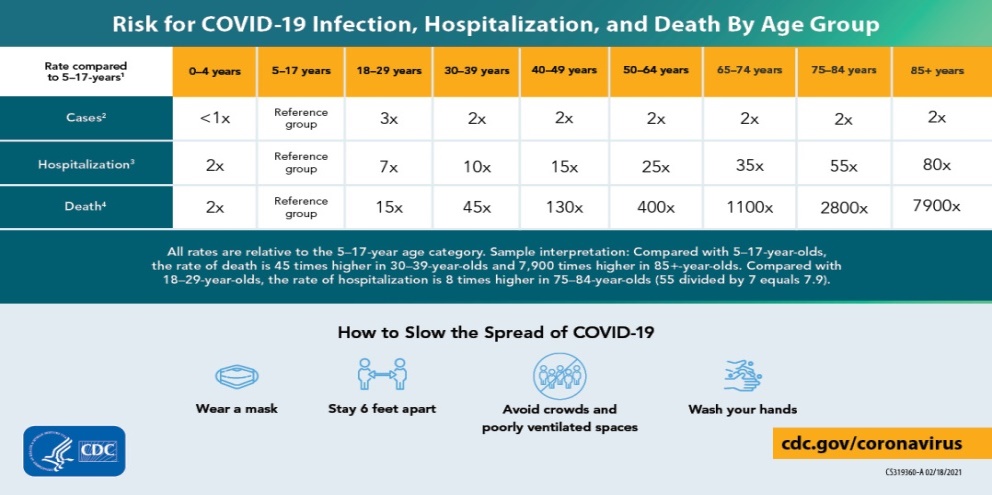
This means that the 50-64 age group has about 27 times the risk of the 18-29 age group for example. So one dose delivered in the 50-64 group has the same life saving effect as 27 doses to the 18-29 age group. Oldest to youngest is how you really multiply the value of scarce doses.
This also means that comorbidities (which range from 1.1x to 9x increased risk) are equivalent to just being 1 to 20 years older and healthy. So even the unhealthiest people in the 18-29 group have 3x less risk than regular people in the 50-64 age group.
We understand that risk data can be hard to understand or visualize, especially when you think about how the data might apply to something dynamic like vaccination over time. So we converted the raw data into something that hopefully anyone can understand: the “lives saved” calculator above.
You can use it to see for yourself (and show others) how important it is to prioritize by age while vaccine supplies are limited.
If your state is one of those thinking about opening up to everyone under 65, please share this so they can think again about that 27x risk difference between different age groups under 65. If your county or city has discretion in allocation, please share this so they can keep moving down the age curve in 5 or 10 year increments to match the highest risk people with limited local supply.
If you are with a state or county or city, we’ve been working with COVID risk data since February 2020, so if you’d like a free and immediate expert review of your prioritization plans and options, we’re happy to help get everyone on board with an optimal plan, just email us at hello@flashvote.com.
Saving as many lives as possible is a polite way of saying “not causing people to die”, which is why we felt like we had to do something in this case. You can help by spreading the word. Remember that even if you never know the names of the tens or hundreds or thousands needlessly lost in your state, their families will.
How “lives saved” are calculated
Our “lived saved calculator” uses COVID mortality data in the US to estimate expected death rates for different groups, including those used by the CDC for reporting (85+, 75-84, 65-74, 50-64, 40-49, 30-39 and 18-29). Under 18 is not included, which is an approximate fit for vaccines only being approved for people 16 or older.
We use historical vaccination data for people getting one or more doses (from Dec 14, 2020 to March 17, 2021) to calculate the maximum daily number of people who can vaccinated, using a daily percentage of the population vaccinated. Then we extrapolate forward into May using the historical rates of increase in weekly vaccination totals. We take the weekly 7 day totals and apply an average for each day in that week as the daily maximum number of people vaccinated.
We use vaccine effectiveness of 100% against death. While the different vaccines may have varying rates of effectiveness against “infection with symptoms”, all of them appear to have approximately 100% effectiveness against infection requiring hospitalization or leading to death, even with one out of two doses.
We use the selected prioritization system to take different groups of US adults and place them in line to receive vaccination allocations. If two or more groups are in a specific tier together they receive vaccine proportional to their population until that tier is complete.
We use a 30% “vaccine hesitancy” number based on our public opinion research and others so that when 70% of a group is vaccinated, that tier is complete and we move on to vaccinating the next tier.
We use US death rates by group and US age distributions as an approximation for the death and age distribution in each state. We use the 7 day average of daily COVID deaths in each state as of January 13, 2021 as a baseline for ongoing deaths in that state without vaccination. A higher or lower baseline could also be used but would only change the absolute numbers without changing the relative effects.
Why we made this
We’re data and government experts on a mission to help every public official make better decisions for their constituents all year long. So we can’t really sit still and watch decisions that will cost lives because they aren’t using the data available.
Since we needed to do something, we thought of sharing the data with a calculator to hopefully help spread that knowledge easily. And we needed somewhere to put the calculator, so here it is on our FlashVote website where you can share it.
If you are wondering what FlashVote is, it’s a patent pending way to collect statistically valid community input in 48 hours. We created FlashVote so local governments across the US could have fast and valid data on community wants, needs and priorities whenever they need it. We’ve helped cities, counties and states with data for important COVID related and other decisions throughout the pandemic. You are welcome to poke around the website or contact us if you want to learn more about bringing FlashVote to your community.
But before you do that, please share this calculator with your city, county or state officials – before it’s too late.